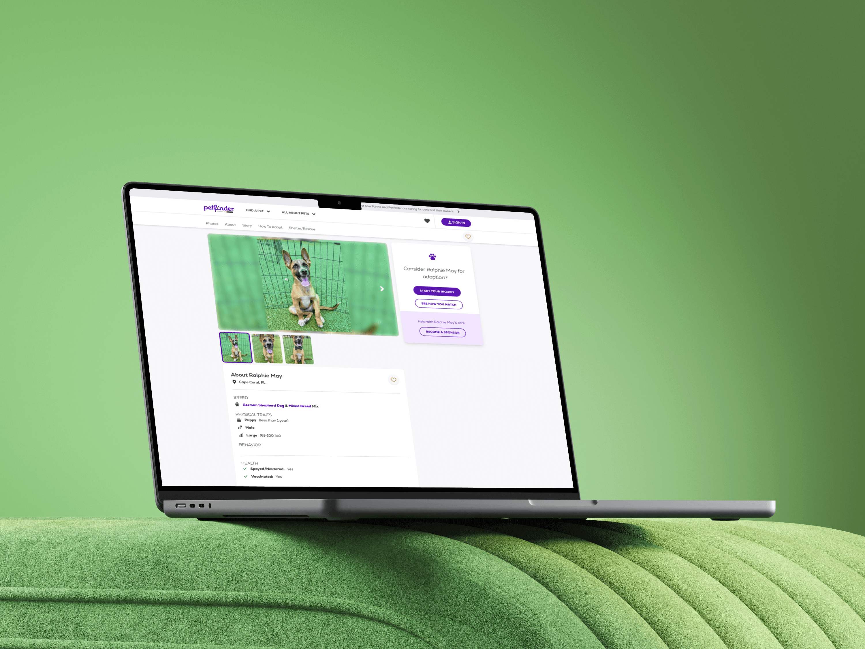
Nestle Purina's Petfinder
Led successful initiative to tokenize, expand and meet WCAG compliance throughout the design system, leading to a 40% decrease in turn around time.

The Problem
The Petfinder design system was never fully documented and also had major accessibility issues throughout. This inevitably slowed the design process for the design team and failed multiple WCAG compliance tests. I identified these issues early on and got buy in to properly addressing these major issues, restructuring documentation and fully tokenizing in Figma.
User Need
Designers and devs need a flexible, scalable and accessible design system to optimize the design and dev process, which also would lead to a consistent and an improved customer experience.
Business Goal
Decrease design and dev turn around time while meeting WCAG guidelines.


The Approach
UI Audit
I started off fully documenting all of the major UIs and components, then used the Stark plugin in tandem with partnering with Fable to establish accessibility documentation, followed by extracting the necessary styles for documentation.
What stood out in the process was that there was clearly a lack of a11y testing throughout the design process, so establishing the ways of working to avoid some of these foundational issues in the future was necessary.
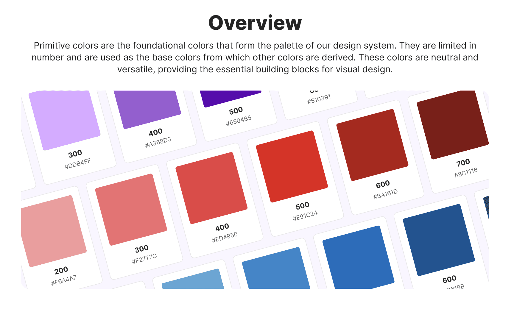
Foundations
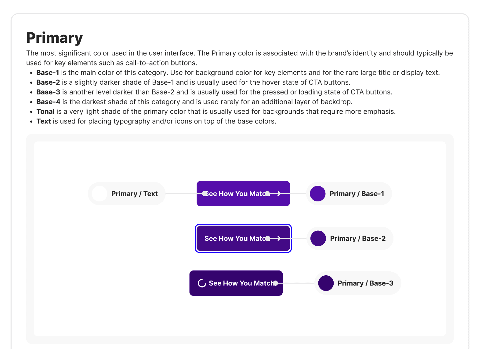
After a full extraction of the styles use throughout the UX, I fully documented the primitive colors and began to establish ways of working with these from the primitive layer. I proceeded to do the same for typography, borders, effects and layouts.
This also surfaced the opportunity to add motion to the the UX as we only had 1 instance where motion was used for toasts.
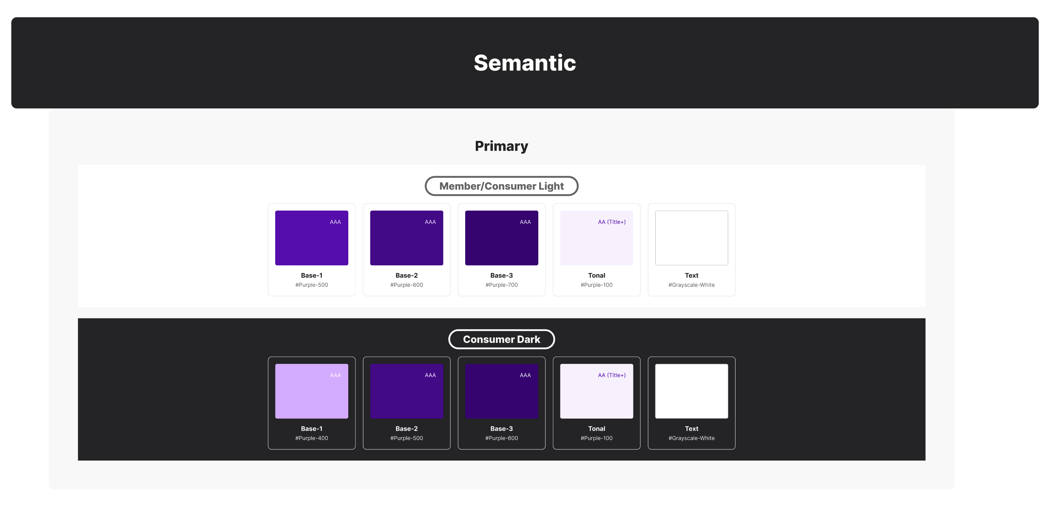
Tokenization
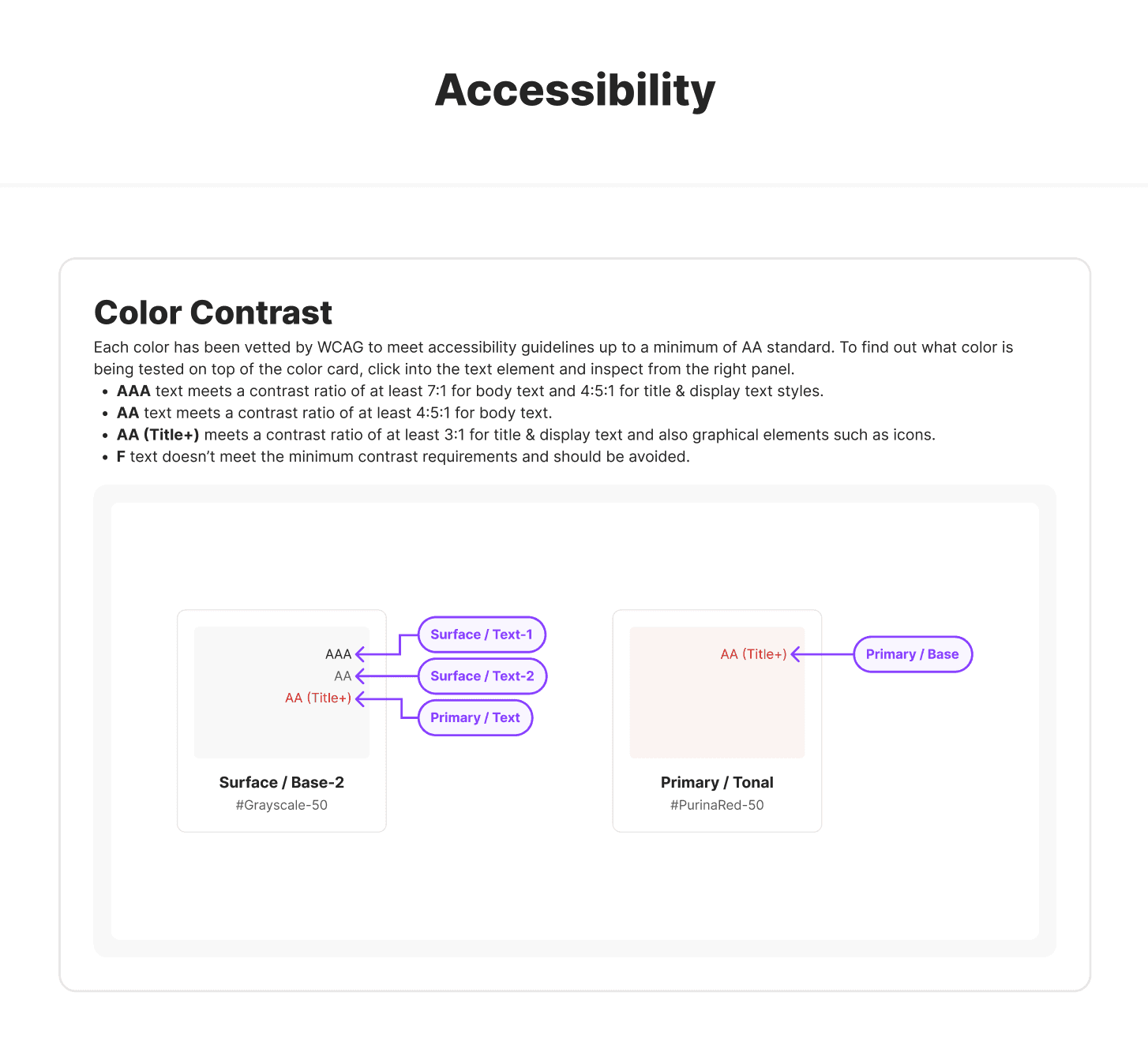
After establishing the primitives I moved onto the semantic layer, ensuring proper naming conventions and WCAG compliance throughout all styles.
I also ran a facilitation session with the team to get confirmation on the interpretation of the naming conventions used for alignment. We also tested what implementation would look like before moving onto assets.
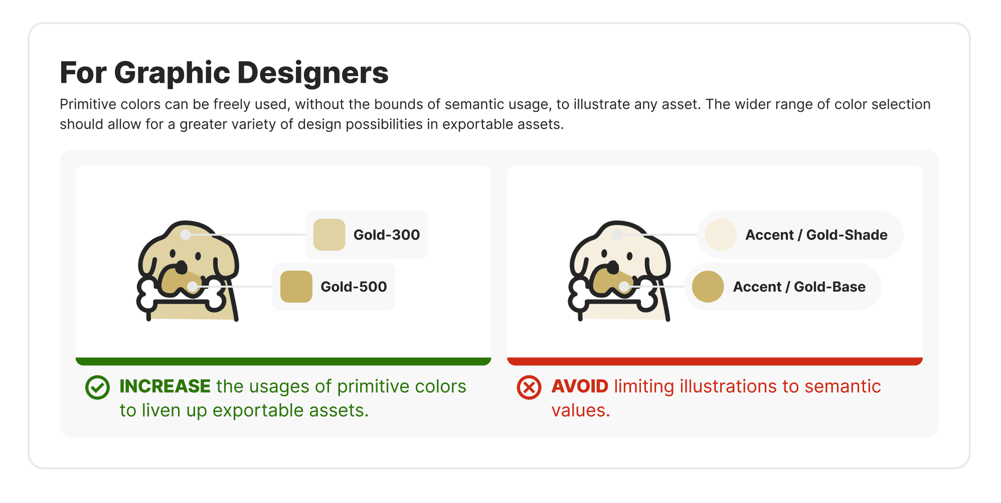
Assets
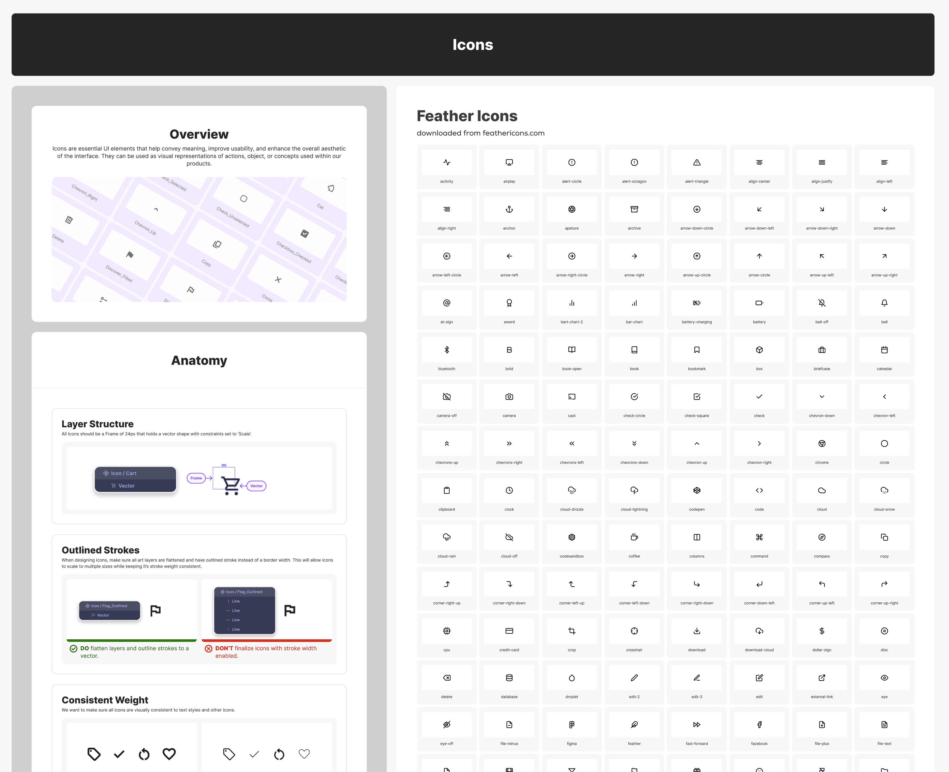
The extraction of the iconography also highlighted some glaring issues with a mix of styles and sizes, added to a lack of proper usage of containers for scalability. I was able to get buy-in on streamlining the styles of most of the icons used throughout the UI which really helped with consistency.
I also worked through documentation of the images, illustrations, logos and pictograms and created relevant component sets for easy access.
Components
Here is where the fun began! It is always very satisfying to use a tokenized system to start to establish components. The rework with an existing system could be tedious, but the revelation of the impacts to the improved speed of design turn around is almost nourishing!
Additionally, it helps to surface any overlooked structuring than breaks responsive components and really brings a nice design challenge of optimization for ease of use.

Main Takeaways & Impact
Having a fully functioning design system could be one of the most impactful assets of any design team and organization. The process of completing it covers all the necessary facets to surface major overlooked issues within any product and allows for addressing these issues granularly, while mitigating creating other issues in the future. It is definitely a lot of work, but it makes design much more fun and empowering.
This effort led to a 40% decrease in design turn around time.
Designers also mentioned major satisfaction with the ease of switching from light mode to dark mode, and easily accessing components, assets and styles.
We were able to accomplish AA compliance at minimum, and AAA where feasible.
Devs also mentioned a clear appreciation and a ease of effort of implementing the new handoff assets.